Student Project

Tuesday, March 15, 2011

Infographics Final Map


This infographic map is based on my experience living in Portland for the past 6 months. I've highlighted routes and places that I've frequented, as well as a few memorable experiences. The images were painted to give it a more hand-done/first-hand experience feel, although I actually used Google Street View to reference a number of locations. This also cites back to my use of Google Maps whenever I need directions to get from one place to another. It would be interesting to keep adding more places as time goes on and my experience in Portland expands.

MAX


Portland is nationally renowned for our use of light-rail transit, adding to our reputation as one of the "greenest" cities in America. With the praise we receive for our light-rail infrastructure, we continue to expand MAX lines to provide greater access to the Portland-area community. However, when one examines the data of transit ridership over time we discover that the increase in ridership is not keeping up with population growth. While the numbers of riders are consistently increasing, the percentage of commuters in relation to the population is actually slightly decreasing. In 1980 9.8% of Portland-area commuters used public transit, today that number is only 7.5%. If we expect to continue touting our city as the progressive model for light-rail use, then it is important that we do more than expand MAX lines and find solutions to increase the percentage of the population that use MAX.


Where I go


Here is my final project one as well. Somewhat revised.

SkyLine


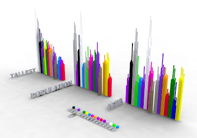
SkyLine is a visualization of what it means to be a "big" city. Portland is known as a little big city and i was curious as to what that meant. I researched 16 cities and collected data on their tallest buildings, population, and area.

Through my data collection I created a skyline of America. The cities i chose all came to mind when i thought about big cities in America.

Seattle, Portland, San Francisco, San Diego, Los Angeles, Las Vegas, Salt Lake City Austin, Houston, Oklahoma City, Chicago, Detroit, Boston, New York City, Wshington DC and Miami.

To start I collected the top 9 tallest buildings from each city and phyisically combined them to create a SkyScraper for each city.


This is a digital model showing these SkyScrapers arranged by city area, population and Building height.


I also created a 3D visualization of SkyLine out of lazer cut MDF showing the SkyScrapers placed acording to location across a plane of the united states. The ground plane is meant to disappear as the SkyScrapers jut out of it. The circles around the each SkyScraper are a scaled representation of the city area, combined with the height of the buildings it gives an idea of densisty and urban sprawl. You will notice that Oklahoma City has one of the shortest SkyScrapers but the largest city area.

This image is looking West from the East Coast and is focused on Portland.
This is looking up the west coast from what would be Mexico. Portland and Seattle are the focal points.
The SkyLine from the South East

Constructing the SkyScrapers
Assembly and area indicator detail

Interactive Portland Neighborhood Map


Basically, for my final infographic I wanted to use interactivity to convey more information about the neighborhoods in Portland. The print version color coded and rated Portland's neighborhoods in order of house value and cost of living, but I also wanted to reveal who lives in each of the neighborhoods to see if it there was any correlations. The new information gives total population, percentage of college grads and their median income. I couldn't figure out how I could upload the swf to the blog so here are a few screen shots of some of the features.

Monday, March 14, 2011

Dean's Final Project

This project was a visualization of the difference between a West Coast and an East Coast NBA team. The red lines represent distance traveled by the Portland Trailblazers and the Green lines represent the distance traveled by the Boston Celtics. Both teams are located in the Northern hemisphere of the United States, however, because teams are packed in closer on the Eastern conference, Eastern teams have much less distance to travel. This is one of the reasons why players prefer playing on the East Coast.


Final Project


This project was all about documenting my trips around Portland as I took photographs. The dates span from November of 2010 to March of 2011. I drew the map by hand and only marked streets relevant to where I went and what I took photos of so it acts as more of a "treasure map" for me and less of a google map. The corresponding contact sheet of photos is chronologically ordered so you can somewhat trace photographs to location on the map.